
If you haven’t yet read it, first check out part one of this two part series; the first article focused on my philosophy in regards to comic covers and their importance to a comic. To reiterate I made three main points:
A cover should set the tone and mood for a series and reflect the story being told.
A cover should act as a ‘hook’ that peaks the readers interest in the story to come.
Cover designs should be instantly recognizable across a series.
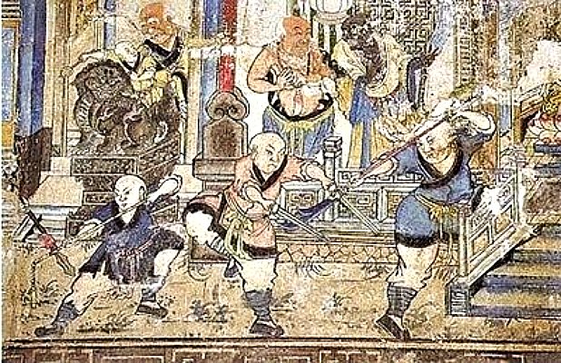
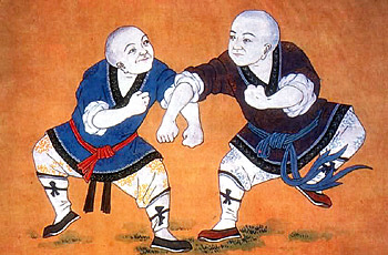
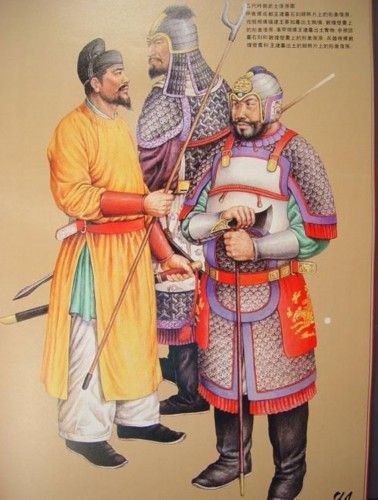
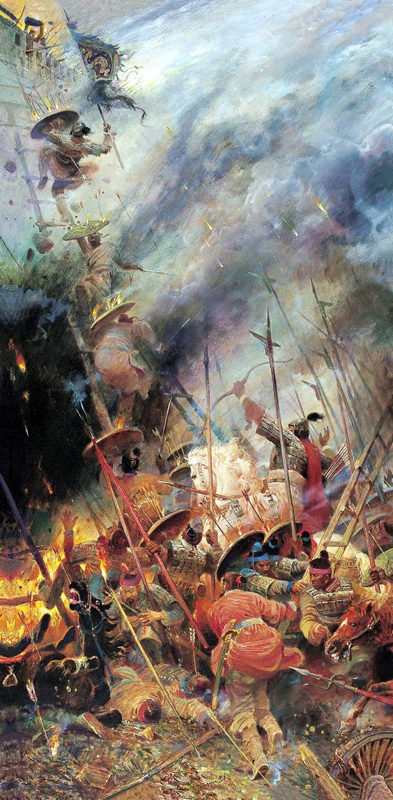
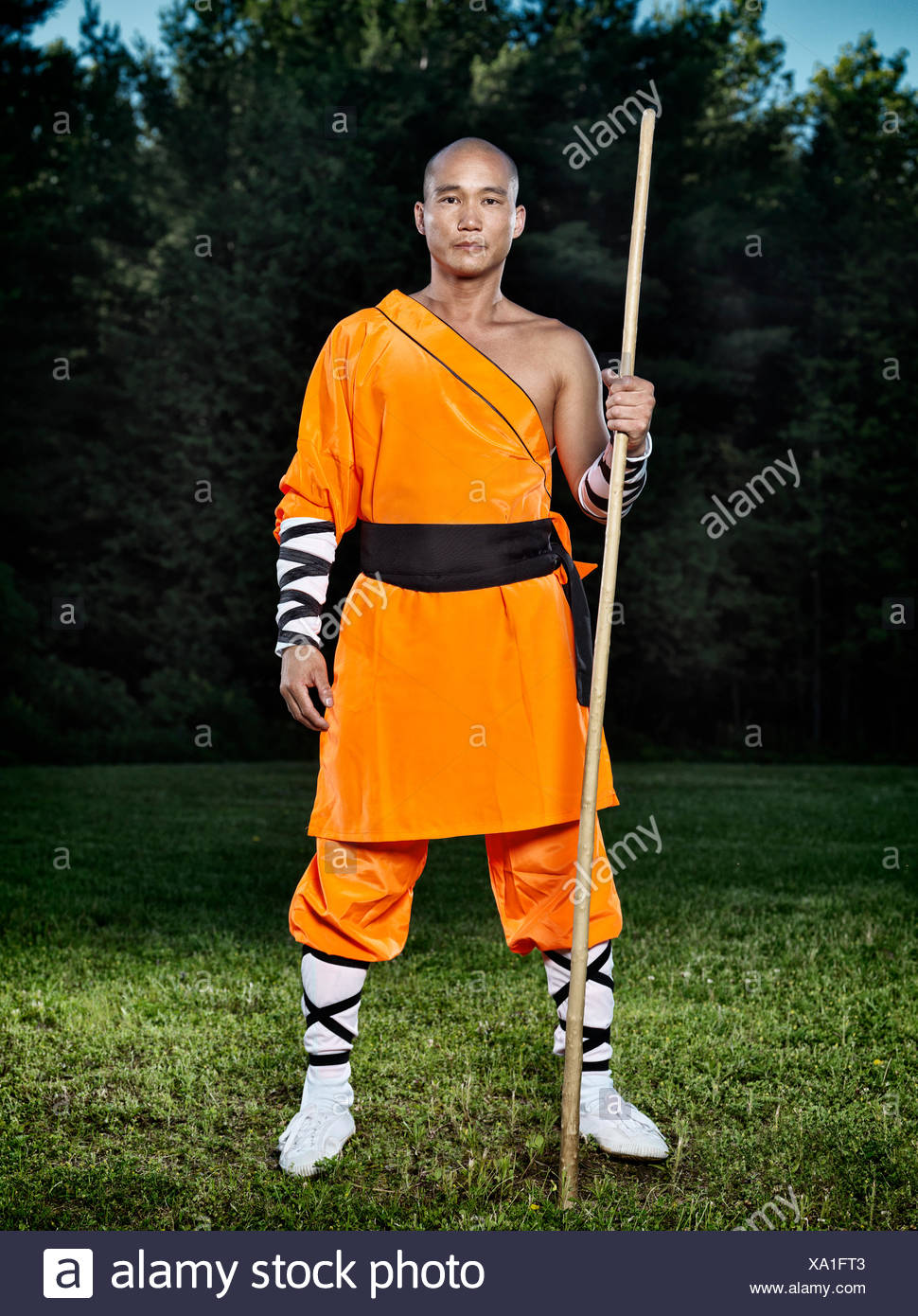
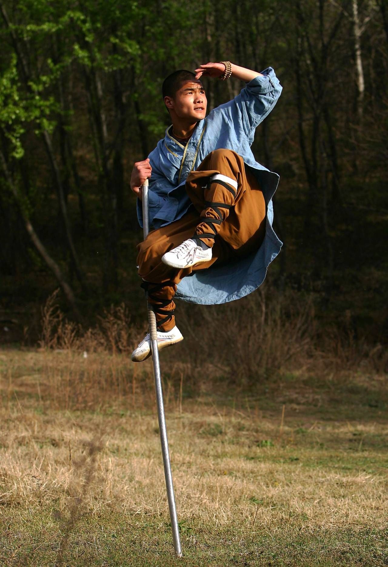
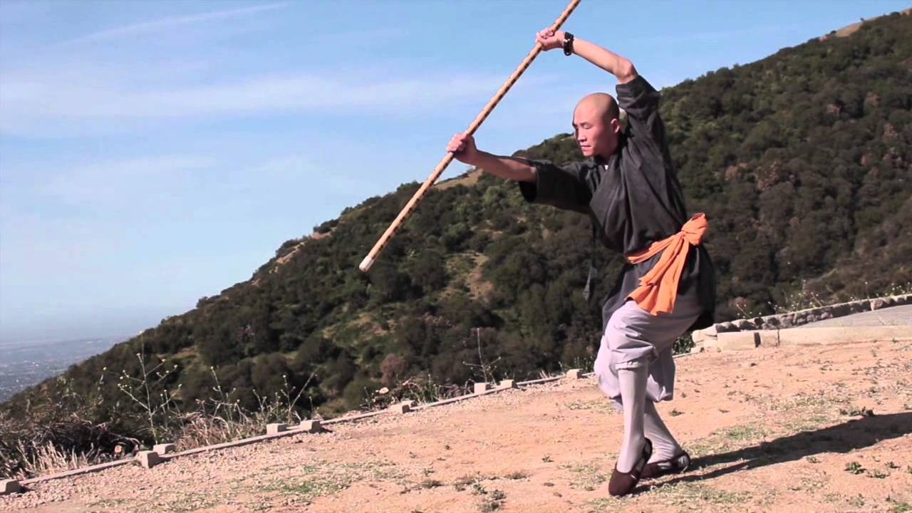
For part two, the focus is going to be on the process of developing a unique cover design with your comic series in mind. As an example, we will take a look at the cover design process for the series, “13” by Chris Massari in which I’ve been hired to design cover work. The series focuses on the legend of 13 Shaolin monks who helped to defeated two rebel dynasties in 7th-Century AD.
Step One: Gathering Reference
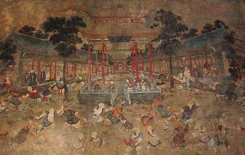
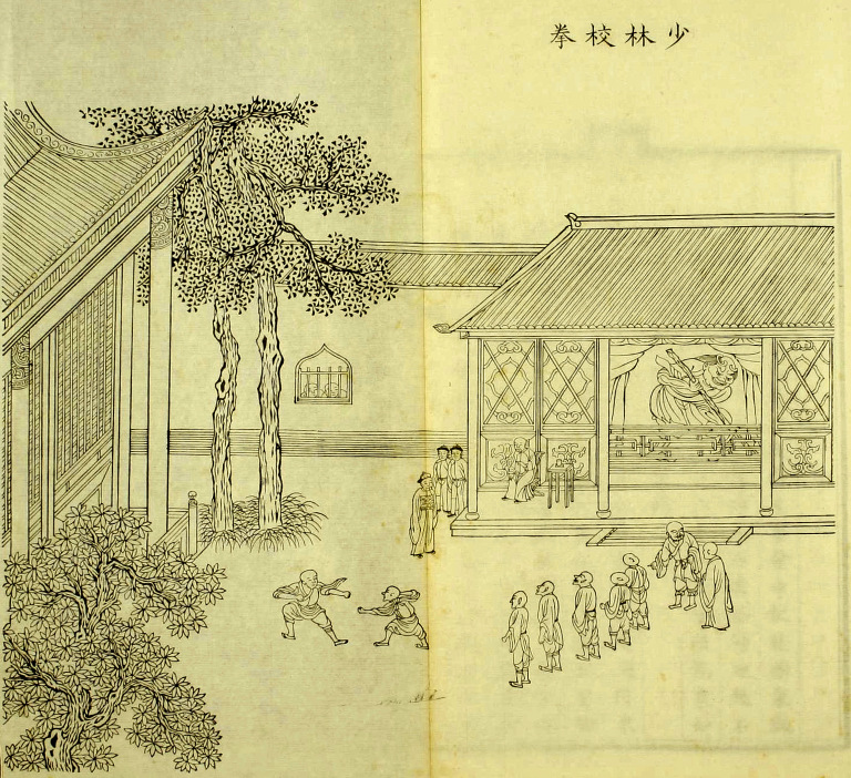
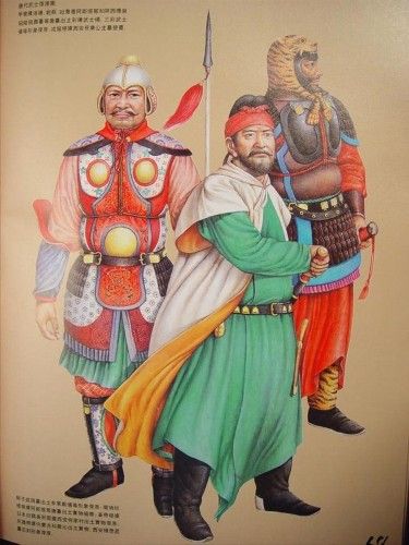
My first step is to gather reference material and begin to study the subject matter surrounding a series. This is the foundational structure upon which all the creative visuals will build. Often the smallest detail can become a cornerstone upon which a unique concept will be built. Luckily for this project Chris is actually an astute researcher and had assembled a great amount of reference for me to begin with. This initial gathering of reference is the first round of reference collection. As a direction is narrowed down, more specified references will need to be gathered for specific elements. The most important part of this step is to ‘get your head in the game’. You want to start charging your creative mind with the subject matter of the comic series.


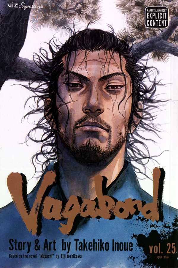
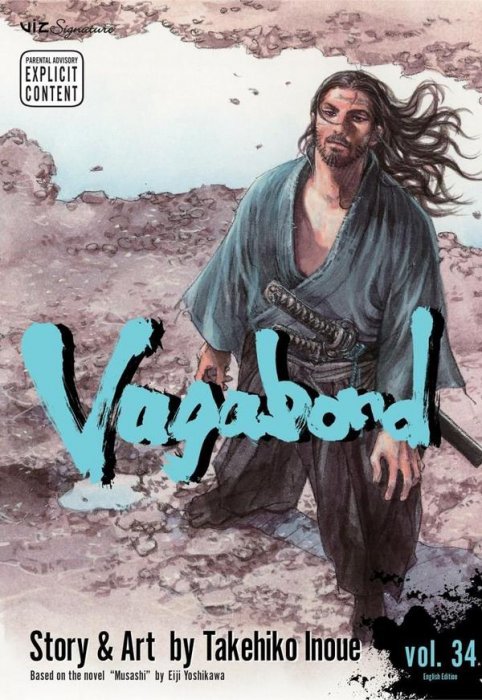
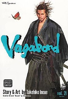
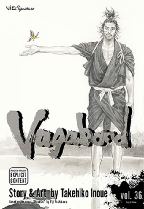
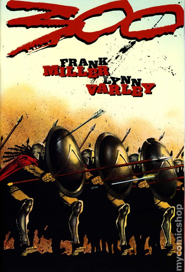
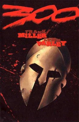
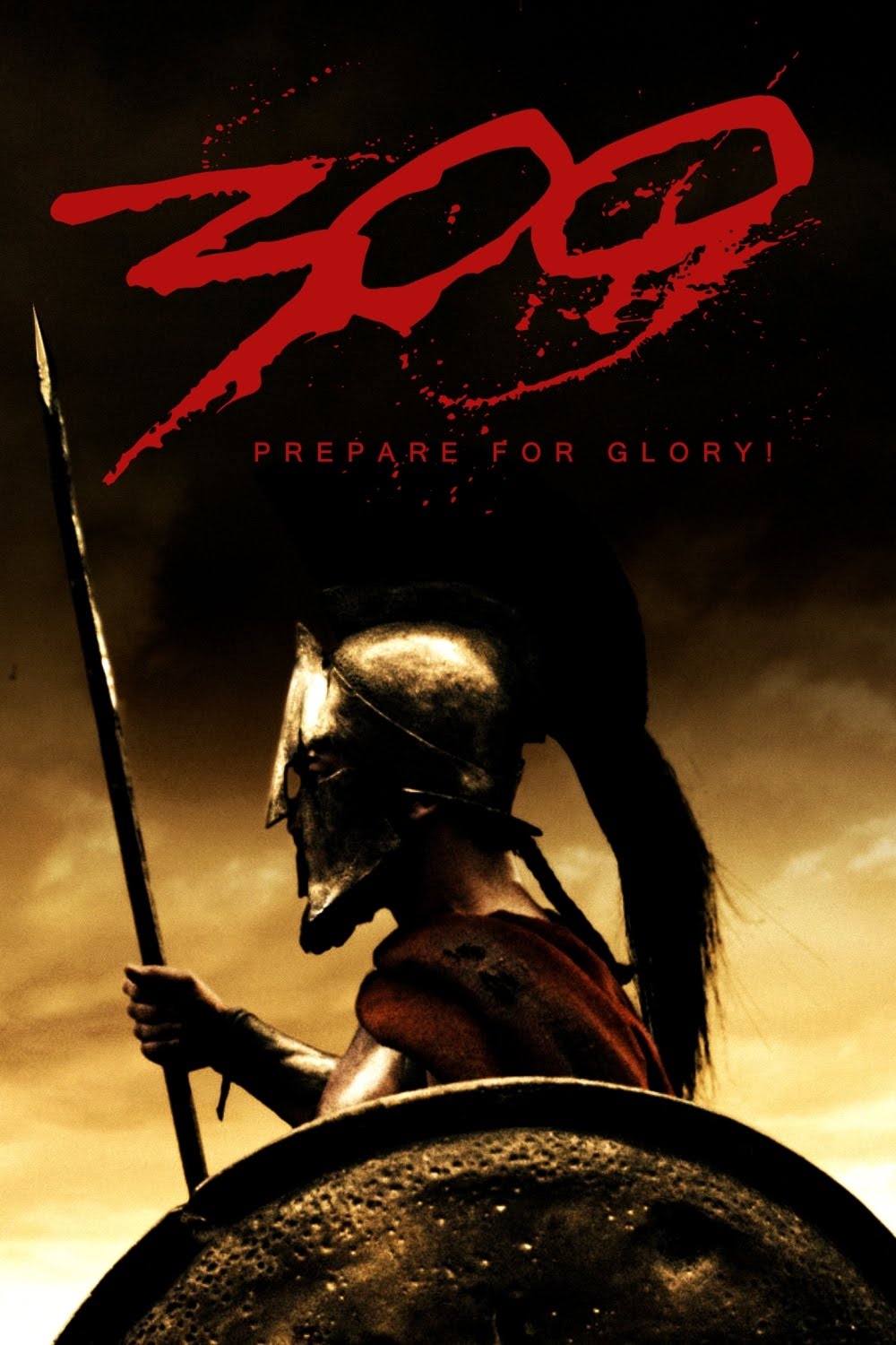
Alongside your subject references, it’s also important to start contemplating the mood & feel of the comic series. Chris had expressed two major influences which he had in mind while creating of the series: 300 by Frank Miller; and Vagabond by Takehiko Inoue. Upon exploring the two series, there was a quick realization that they had very different tonalities from one another. 300 had covers which were loud, graphic and implying excessive violence, where as Vagabond chose calm, serine and quite moments in between violence and conflict. Therefore, my approach pitching design direction to Chris was to explore both paths at their extremes and then offer a third option, the middle way, trying to incorporate the essence of both books.

Step Two: Sketching and Thumbnails
Once the reference is gathered, its time to pour a big cup of coffee and let things rattle around in your creative mind. In the early stages of sketching it is important to think in broad strokes. This prevents getting lost in the details on any one concepts. Let yourself be playful and explore without restriction.
With a sketch book and pencil in hand, I begin to pluck images from my mind onto the paper. I began traveling down the direction influenced by, Vagabond. The reason for this is that I believe in finding elements that will make a cover unique on the shelf. I appreciate the Eastern manga style of exploring quite moments within a story. This is very popular in manga comics, however it is incredibly rare in the American comic market. Next I studied the 300 covers and tried a more minimal approach then I attempted to combine the feeling of the two together. I always thumbnail covers at approximately 2” X 3”. Here are the results of the sketching stage:

Eastern Influence: The first direction explores a solitary moment of contemplation prior to battle. The image of a warrior monk gazing at his reflection in a pond, mentally battling the decision to participate in war. This concept is visited again in the last direction with dramatic a twist. My initial take was to focus on the warrior’s entire figure and have it enveloped by the environment. This concept focused on the old adage that a person pushes out onto the world to shape it but the world is always pushing back shaping the individual. I wanted to have a few falling flower petals to evoke a trickling in of danger into this serine environment.
Western Influence: Frank Miller is known for having graphical covers. They are loud and scream ‘danger’. I wanted to use typography stripped down on a red background incorporating a weapon in with the number 13. Ultimately if this comic was going to be a blood bath, this would be the direction to go. Thankfully, Chris was much more interested in merging the essence of comics from the East into the Western market than repeating the traditional excessive violence found in American comics since the 80s’s.
East Meets West: This was my attempt to marry the two extremes. I wanted to take a moment after battle, pull back and show a moment of contemplation. This time we see the actual reflection of the warrior’s face as he meditates on the actions he has taken. By displaying a blood stained face inside a calm pool of water there is a juxtopsing of violence and peace. The sword next to the puddle helps to reinforce the idea of battle. Chris appreciated this direction, but was really excited about exploring the direction of the first thumbnail that had a more Eastern influence.
Step three: refining Thumbnails & finalizing reference
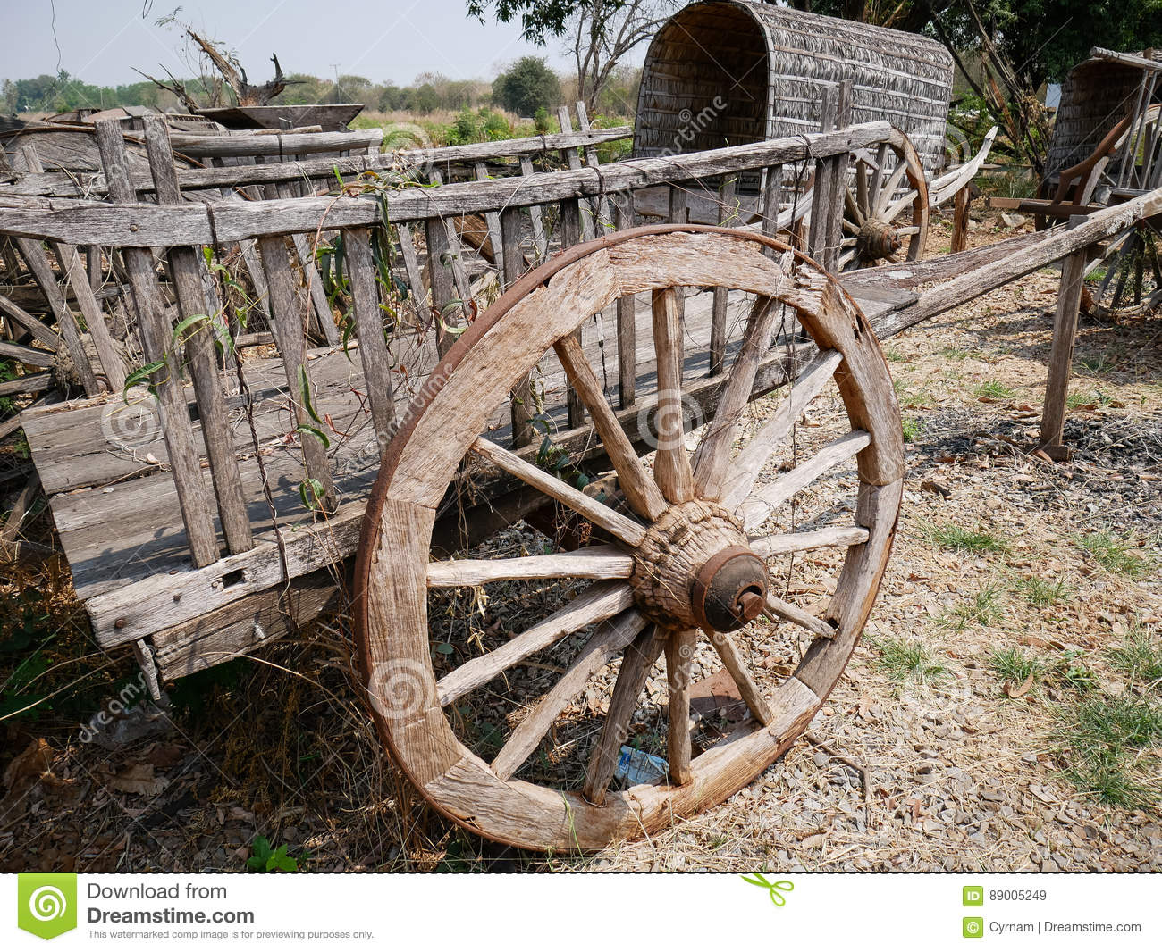
The next stage is my favorite part of the process; crafting the final direction and solidifying the details. Chris and I both decided the image needed more of an allusion of the war to come. After expressing interest in perhaps having a few arrows landing in the scene, Chris suggested using a wheel as a nod to dharmachakra (representing the Buddhist teaching and walking of the path to Enlightenment). To add to the metaphor, we chose to have the wheel be broken. This sybolizes that the monks path to enlightenment, through isolation, was broken and about to be challenged by the war to come.
These little symbolic gems grow as the image is revised. In each phase there is a potential for new elements that build upon the previous ones. Keep in mind, it is important to edit and remove just as much as you focus on adding to an image. For example, we had also discussed adding a crane, as it is the bird representing Vajrapani (the god venerated by the Shaolin monks). However we decided that it took away from the quietness which the image so effective. Also, it wasn’t directly relevant to the message of the first cover, so in the end it was kept out.

After cementing the direction of the final composition and elements, there was another round of gathering references specific to the image. These were the last bits of detail to assure that everything looks and feels proper. It may seem like a lot of effort sorting through images, but it will pay off in the end.


Stage four: Rendering
This article isn’t focused on how to create a cover image, rather it revolves around the thought-process behind creating a cover image. Therefore, I won’t go into the details of execution, but I will examine the thought behind the color palette I chose.
My approach to rendering a cover varies depending on the project. With the covers for “13” I wanted to bring elements from the East and incorporate them into my western style. I’m not an artistic chameleon, ultimately I want my images to feel recognizable as my personal style. However, I did want to capture the essence and tone of Chinese ink wash.
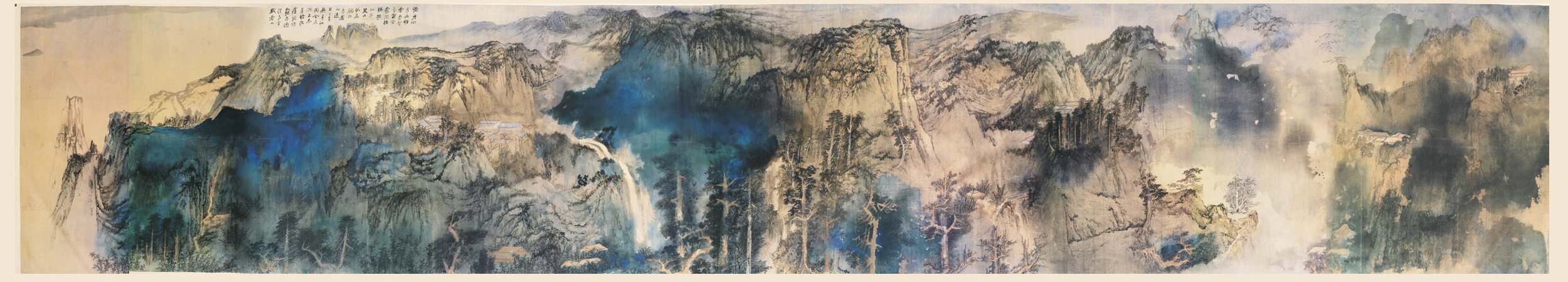
I love the mood of these long scrolls, especially the fog it catches drifting up from the water. It creates a stark contrast of dark and light tones. The goal was to create a tonally dark foreground that quickly becomes lighter in tone due to the fog of the environment.
There is an intentional limitation on the amount of color in the scene. This limited color helps to evoke the feeling of ink wash scrolls. I chose limit the color to the primary elements of the scene: the monk; the flower petals, and a touch of color on the wheel. The majority of the scene is a de-saturated cool grey which allows the character to be the central focus. Having established this approach on the first issue one, it will be subsequently applied to every cover following. Part of the fun of cover design is establishing a rule set and then experimenting within that structure.
With all that in mind, below is the result of the final cover image for 13 issue 01. As always, if you enjoyed the article, please share and like on social networks and the like. Until next time, Keep Making Comics!
