Covers

Designing a Comic Cover (Part 1 of 2)

There is the old saying, “Don’t judge a book by its cover.” While this may be true for a novel, in regards to a comic book cover this couldn’t be further from the truth.

Every writer will tell you that the first paragraph should set the tone for the coming novel. The importance of this introduction is referred to as the ‘hook’. A comic book is unique in that it is a combination of images & words which together convey the story. Given that comic books are a visual medium, the cover in turn becomes the ‘hook’ to its story.

A classic example of a cover’s impact on story comes from the most well known graphic novel, WATCHMAN. Dave Gibbons uses the cover as the first panel to the series. The cover’s abstract yellow background covered in a blood stain works as a strong attactor. It isn’t until the reader opens to the first page that the abstract yellow transforms into a smiley face button in a pool of blood on the first panel.

watchman.jpg

To me, this understanding of a cover’s connection and ability to elevate story is what separates the banal monthly comic covers from the masterful works of art. Considering that graphic novels (trades) are often a collection of monthly single issues, it is important to take into account a design thread that ties an entire series together. Now, obviously not every cover should be a literal first panel to a comic’s interior. That treatment would quickly become redundant. However, there are many unique and interesting ways to utilize a cover to set the tone of a book. Let’s take a look at a few examples of comic series with strong cover design.


Southern Bastards

Interior art and cover design by Jason Latour.

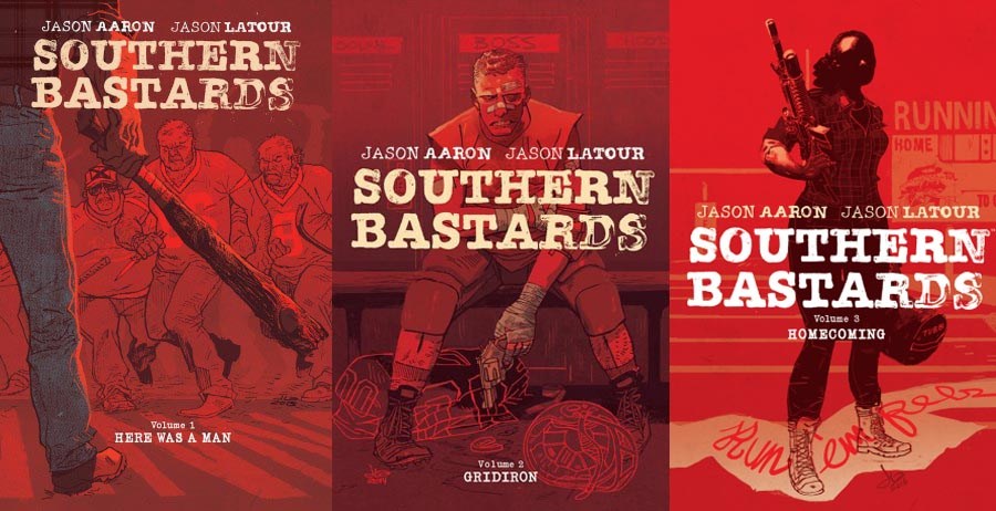
The covers for this series are a prime example of strong and consistent design and storytelling. In general, cover art is strongest when illustrated by the same artist working on interiors. This isn’t to say there aren’t talented ‘cover artists creating covers, however there is a dissonance that occurs when the art varies from cover to interior.

For the cover art on SOUTHERN BASTARDS, Jason’s use of bold, loud monochromatic red (with a few hints of other neutral color tones) cries out at the viewer from the shelf. It elicits danger and screams, “There will be blood.” Each cover also reinforces an allusion to violence through the use of a ‘weapon in hand’ in the central figure. If you examine the single issue covers across the story arc, they tell the shifting of power from one issue to another. One could easily explore a an entire blog article on the series covers in themselves (and may do so in the future) but I’ll save that analysis for a later time. Mainly, I included this series because it’s heavy monochromatic red design made it unique to anything else on the shelf and it remained consistent throughout the series.


The Wicked + The Divine

Interior art and cover design by Jamie Mcklevie

WickedNDivine.jpg

The Wicked + The Divine has one of the most powerful series of cover designs in the industry and is immediately recognizable. The story revolves around 12 gods who remerge from generation to generation in relevant/current forms. Each cover is starkly centers on a frontal portrait of one of the gods. This playful framing acts as an introduction and focus on each character individually. It also creates a wonderful rhythm for the reader and becomes a glue tying the issues together (Side note: it also is a perfect enticement for collectors). The super saturated color palettes all tie together nicely and sets the supernatural tone for the series as well. The unique logo design goes a long way to make the covers an instant classic.


The Vision: Little Worse Than A Man

Covers by Mike del Mundo

Vision.jpg

Here is an example to counter my earlier statement that the best comic covers are done by the same artist working on the interior art. This series of covers by Mike del Mundo wonderfully sets the tone for the series capturing a - pastel, perfect, picturesque, 1950’s, white picket-fence - life with an abnormal ‘super’ twist. The color palette again elegantly ties the series together perfectly. Everytime one revisits the comic shelves its easy to spot the book month-to-month. This attention to detail is incredibly important to draw in returning fans and it makes for a wonderful collection for comic collectors.


Void Trip

Interior art and cover design by Plaid Klaus

covers.jpg

Here’s a little ‘shameless-self-promotion’. When I was designing covers for VOID TRIP I was incredibly conscious of establishing a consistent look and feel for the series. I chose a vibrant candy-colored palette with neon greens and purples. The story is about a psychedelic road trip in space, so the greens evoke glowing galaxies and the purples feel like the warm gaseous clouds of space. The logo I intentionally designed to be intimately small since you typically find loud/large logos on the shelf. Also, I made the logo center frame and used it as a symbolic element throughout each cover. Representing a sun, a void and the force of life. Again, I built a lot of symbolism into each cover, which I plan to do a unique blog post about at a later date.

For now, what I’d like to leave as a take home for fellow comic creators is that a cover should not be thought of as a ‘shiny lure’ to attract a reader. It does have to be that, but it should be much more. Covers should be a cohesive binding agent for the series and should also tell the story’s arc at a glance. In addition it must immediately capture the mood of the series by setting the proper tone.

Hopefully this article has helped shed some light on the value of a comic book cover. That way you can avoid the awful and meaningless, ‘character montage’, covers which are designed to push books based on fandom…like so…

If you enjoyed the read share it around and let me know on twitter and check back for more in the future!

Designing a Comic Cover (Part 2 of 2)

Untitled-1.jpg

If you haven’t yet read it, first check out part one of this two part series; the first article focused on my philosophy in regards to comic covers and their importance to a comic. To reiterate I made three main points:

  1. A cover should set the tone and mood for a series and reflect the story being told.

  2. A cover should act as a ‘hook’ that peaks the readers interest in the story to come.

  3. Cover designs should be instantly recognizable across a series.

For part two, the focus is going to be on the process of developing a unique cover design with your comic series in mind. As an example, we will take a look at the cover design process for the series, “13” by Chris Massari in which I’ve been hired to design cover work. The series focuses on the legend of 13 Shaolin monks who helped to defeated two rebel dynasties in 7th-Century AD.


Step One: Gathering Reference

My first step is to gather reference material and begin to study the subject matter surrounding a series. This is the foundational structure upon which all the creative visuals will build. Often the smallest detail can become a cornerstone upon which a unique concept will be built. Luckily for this project Chris is actually an astute researcher and had assembled a great amount of reference for me to begin with. This initial gathering of reference is the first round of reference collection. As a direction is narrowed down, more specified references will need to be gathered for specific elements. The most important part of this step is to ‘get your head in the game’. You want to start charging your creative mind with the subject matter of the comic series.

Alongside your subject references, it’s also important to start contemplating the mood & feel of the comic series. Chris had expressed two major influences which he had in mind while creating of the series: 300 by Frank Miller; and Vagabond by Takehiko Inoue. Upon exploring the two series, there was a quick realization that they had very different tonalities from one another. 300 had covers which were loud, graphic and implying excessive violence, where as Vagabond chose calm, serine and quite moments in between violence and conflict. Therefore, my approach pitching design direction to Chris was to explore both paths at their extremes and then offer a third option, the middle way, trying to incorporate the essence of both books.


Step Two: Sketching and Thumbnails

Once the reference is gathered, its time to pour a big cup of coffee and let things rattle around in your creative mind. In the early stages of sketching it is important to think in broad strokes. This prevents getting lost in the details on any one concepts. Let yourself be playful and explore without restriction.

With a sketch book and pencil in hand, I begin to pluck images from my mind onto the paper. I began traveling down the direction influenced by, Vagabond. The reason for this is that I believe in finding elements that will make a cover unique on the shelf. I appreciate the Eastern manga style of exploring quite moments within a story. This is very popular in manga comics, however it is incredibly rare in the American comic market. Next I studied the 300 covers and tried a more minimal approach then I attempted to combine the feeling of the two together. I always thumbnail covers at approximately 2” X 3”. Here are the results of the sketching stage:

13Issue01-Cover-Thumbnails-02.jpg
  1. Eastern Influence: The first direction explores a solitary moment of contemplation prior to battle. The image of a warrior monk gazing at his reflection in a pond, mentally battling the decision to participate in war. This concept is visited again in the last direction with dramatic a twist. My initial take was to focus on the warrior’s entire figure and have it enveloped by the environment. This concept focused on the old adage that a person pushes out onto the world to shape it but the world is always pushing back shaping the individual. I wanted to have a few falling flower petals to evoke a trickling in of danger into this serine environment.

  2. Western Influence: Frank Miller is known for having graphical covers. They are loud and scream ‘danger’. I wanted to use typography stripped down on a red background incorporating a weapon in with the number 13. Ultimately if this comic was going to be a blood bath, this would be the direction to go. Thankfully, Chris was much more interested in merging the essence of comics from the East into the Western market than repeating the traditional excessive violence found in American comics since the 80s’s.

  3. East Meets West: This was my attempt to marry the two extremes. I wanted to take a moment after battle, pull back and show a moment of contemplation. This time we see the actual reflection of the warrior’s face as he meditates on the actions he has taken. By displaying a blood stained face inside a calm pool of water there is a juxtopsing of violence and peace. The sword next to the puddle helps to reinforce the idea of battle. Chris appreciated this direction, but was really excited about exploring the direction of the first thumbnail that had a more Eastern influence.


Step three: refining Thumbnails & finalizing reference

The next stage is my favorite part of the process; crafting the final direction and solidifying the details. Chris and I both decided the image needed more of an allusion of the war to come. After expressing interest in perhaps having a few arrows landing in the scene, Chris suggested using a wheel as a nod to dharmachakra (representing the Buddhist teaching and walking of the path to Enlightenment). To add to the metaphor, we chose to have the wheel be broken. This sybolizes that the monks path to enlightenment, through isolation, was broken and about to be challenged by the war to come.

These little symbolic gems grow as the image is revised. In each phase there is a potential for new elements that build upon the previous ones. Keep in mind, it is important to edit and remove just as much as you focus on adding to an image. For example, we had also discussed adding a crane, as it is the bird representing Vajrapani (the god venerated by the Shaolin monks). However we decided that it took away from the quietness which the image so effective. Also, it wasn’t directly relevant to the message of the first cover, so in the end it was kept out.

13Issue01-Cover-Thumbnail-E.jpg

After cementing the direction of the final composition and elements, there was another round of gathering references specific to the image. These were the last bits of detail to assure that everything looks and feels proper. It may seem like a lot of effort sorting through images, but it will pay off in the end.


Stage four: Rendering

This article isn’t focused on how to create a cover image, rather it revolves around the thought-process behind creating a cover image. Therefore, I won’t go into the details of execution, but I will examine the thought behind the color palette I chose.

My approach to rendering a cover varies depending on the project. With the covers for “13” I wanted to bring elements from the East and incorporate them into my western style. I’m not an artistic chameleon, ultimately I want my images to feel recognizable as my personal style. However, I did want to capture the essence and tone of Chinese ink wash.

I love the mood of these long scrolls, especially the fog it catches drifting up from the water. It creates a stark contrast of dark and light tones. The goal was to create a tonally dark foreground that quickly becomes lighter in tone due to the fog of the environment.

There is an intentional limitation on the amount of color in the scene. This limited color helps to evoke the feeling of ink wash scrolls. I chose limit the color to the primary elements of the scene: the monk; the flower petals, and a touch of color on the wheel. The majority of the scene is a de-saturated cool grey which allows the character to be the central focus. Having established this approach on the first issue one, it will be subsequently applied to every cover following. Part of the fun of cover design is establishing a rule set and then experimenting within that structure.

With all that in mind, below is the result of the final cover image for 13 issue 01. As always, if you enjoyed the article, please share and like on social networks and the like. Until next time, Keep Making Comics!

13-issue01-Cover-05.jpg